In the summer, I took some photographs; one of which was the new bar/restaurant - Clove Hitch (see below)
This week, there was an oppourtunity to meet the owner himself, and discuss ideas about exhibiting work within the space.
I am hoping to take part in this, and possible produce some new work/ideas to be on display in the Clove Hitch!
Wednesday, 29 September 2010
Tuesday, 14 September 2010
Saturday, 4 September 2010
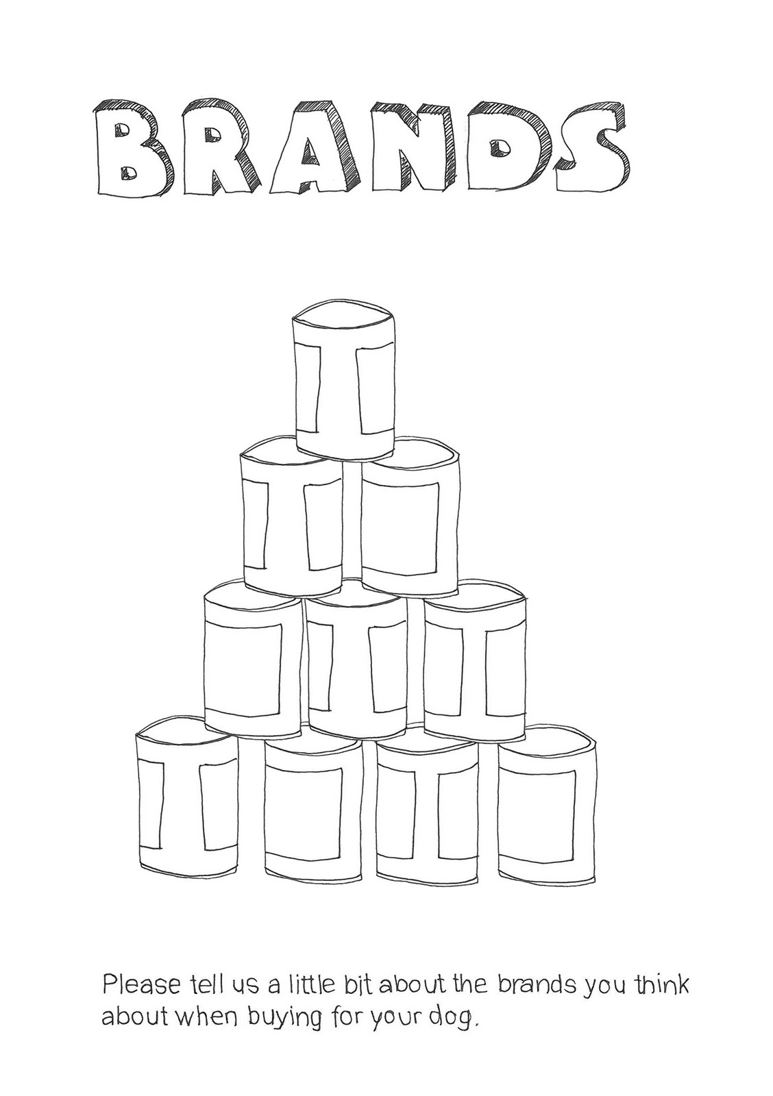
Bluecoat Display Centre : Volunteer Work
I have recently finished a week's volountary work at the Bluecoat Display Centre, Liverpool.
Having reviewed my CV, I felt some volunteer experiences could be participated in. The Bluecoat Display Centre works alongside the Bluecoat Gallery. Selling the work of local and further afield artists and designers, ceramics, textiles and printmakers - the Decorative Arts.
My role covered working with customers, general skills of purchace/selling aswell as working on the bussiness side of reports, stock intake. The experience was an enjoyable one, having too made some connections in the art sector, that could prove useful in the future.
Sunday, 29 August 2010
Tweaking of Cards
Having had a moment away from my designs, I have gone back with fresh eyes, and I am working upon the type and back design on the card.
Updated versions to follow soon!
Updated versions to follow soon!
Sunday, 22 August 2010


Personal Business Card Designs
From designing my own personal logo and website, I decided to produce some business card designs for myself.
I used Illustrator to create my cards.


I then placed my cards on notice boards to 'promote' myself and become more noticed.
The card design shows my website and email address for interested viewers to get in contact.


I used Illustrator to create my cards.


I then placed my cards on notice boards to 'promote' myself and become more noticed.
The card design shows my website and email address for interested viewers to get in contact.


Thursday, 19 August 2010
Personal Logo

My initials collated together to form a unique shape/logo identity for myself.

I then used my logo on a diagonal position, and repeated it several times by reflecting, to produce a symmetrical pattern.

I then repeated this design to form a pattern, which is unique to me.
This is my initial idea, which I'm sure will develop in due course.
Business cards to follow soon!
Wednesday, 18 August 2010

Thursday, 12 August 2010
Photo's

One of my photographs from my 'summer'.
Since I have home, back in suburbia from the city centre, I have taken advantage of the 'greenery' around my home, and visited my local park regularly. I have been focusing upon textures and plants, so going to my local park and taking a few snaps has been enjoyable!
Saturday, 17 July 2010
NonConform Placement
Today, I finished my two week placement at NonConform.
By completing this placement, it has opened my eyes to the working process of this sector; how the company approaches briefs, clients, the bussiness side and keeping a good relationship with client and designer.
Good communication skills are vital to ensure both parties have a gain.
I managed to participate in a number of live briefs that the company were currently working upon.
During my time, I furthered my technical skills and was taught about 'widows and orphans' within typesetting - a topic not taught whilst at university. I covered the spectrum of Graphic Arts and studied under Graphic Design, Illustration, Layout, Typography and Typesetting.
A valuable experience with positive outcomes !
I am also pleased to say that they would like me to return whenever is possible, which was a very warming comment to receive and a hearting way to end my two week placement.
Friday, 16 July 2010
Butchers Dog - Marketing Research : NonConform
My favourite brief at NonConform. I had the chance to design and layout a scrapbook for marketing research; client - Butcher's Dog.


Front & Back covers


Example of a chapter headings within booklet.
The booklet is A5 sized, consisting of 44 pages.


Front & Back covers
The scrap book idea was to allow dog owners to fill out a survey-like set of questions, keep a diary for 8-days, and use the book as a photo collection of thier dog(s).

Example of a chapter headings within booklet.
The booklet is A5 sized, consisting of 44 pages.
I used Indesign for the layout and typesetting, whilst I was producing illustrations to work alongside the text, chapter pages and cover designs.


Example of chapter headings wthin booklet
It was during this brief, I learnt about 'widows and orphans' in typesetting - which has proved useful to me and will help me in my layout design for my GARP.
60 copies of my booklet were printed and handed out to the public which was a bit surreal to grasp!
Photogaphy of the actual booklet coming soon...
Thursday, 15 July 2010
Knowsley Housing Trust : NonConform
Again, I had the advantage of producing some ideas for a campaign for Knowsley Housing Trust, were a new 'red and yellow' card scheme was set into place amongst tenants, and a rewards system for those who pay their rent on time.
This was an exciting brief to research as it was purely from scratch, anything is possible at this point! I drew up some visuals and possible concept ideas for possible logo designs / imagery that could be recognised as KHT's symbol at community fair's / media etc.
Unfourtuntley, I only had a day to work upon some ideas as my placement was coming to an end. However, in may own time, I wish to continue my visuals and see what I come up with.
Inform - Typeface Design : NonConform
I had the oppourtunity to work on a typeface design for Fusion21
This was my first attempt of creating a typeface from scratch, it took me three days to complete this set.
Obviously, there are still some tweaks needed and a set of punctuation marks to accomodate it, which will be updated in time.

Lowercase typeface

Uppercase typeface
NonConform invited me to continue my work on an italic version of the font, as well as a narrow and bold version also.
Monday, 12 July 2010
Stafford & Rural Homes - Annual Report : NonConform
I also took part in producing some ideas for the illustrations/design of Stafford & Rural Homes Annual Report.
The theme was 'delivery/delivering' and along with this, I illustrated some concepts that could be used throughout the report to display information and statistics.


My concept involved the parcels being hand drawn to spell out the title and later, to be vectorised in Illustrator.

The theme was 'delivery/delivering' and along with this, I illustrated some concepts that could be used throughout the report to display information and statistics.

The idea that was chosen was the title; 'Delivering Results' illustrated as parcels, wrapped up being posted through the letterbox of a home.

My concept involved the parcels being hand drawn to spell out the title and later, to be vectorised in Illustrator.
My only concern with this look, was that it could be seen as difficult to read / messy. Therefore, I drew another version, to give the effect of being delivered already, positioned like building blocks on the doormat.
I think this version is more visible / clearer to read; as tenants from all ages receiving this and some will see it more so than others.

The final look is still being proccessed upon.
Friday, 9 July 2010
Manchester Camerata - Brochure Covers : NonConform
Following from a requesting email, the client; Manchester Camerata stated some foundations as to what they would like to appear on the front and back of the Manchester Camerata 2010/11 brochure covers.

Close-up head shots

The client requested two cover designs, one using close-up photography shots and the other to be far away shots. Both covers to have a white spacing around them. The 'Man Cam' logo and 2010/11 to be on the cover and company sponser logos on the rear.
Below shows my two alternative cover versions.
Layout in InDesign.

Close-up head shots

Far away shots
Personally, I prefer the far away shots as I believe this gives a greater understanding of body language to the music as well as facial expression. it also allows the images to breathe individually, working well on the page as a whole.
Wednesday, 7 July 2010
FCS - Financial Consultancy Service : NonConform
I produced some logo's for a Financial Consultancy Service who required a new look for their new boss. I designed the following logo's in Illustrator, producing a small colour pallette and sophisticated shapes and lines.


The logo's above show how I used the 'F' as a square root sign, with reference to Mathematics.
I also attempted combining the letters to create a unique logo within itself that would act as a symbol - referencing the company brand. Other ideas adopted a clear, bold look for the 'FCS' so it stands clear.


I then began to experiment more so with shape, sophisticated and elegant shapes easy on the eye. Shapes and colours produced a calm, relaxing look that didn't over power or appar too heavy. The muted colours relax the logo and is easier on the eye.

These are my final logo ideas for FCS.
Having to design and produce a logo within six hours, I am pleased with my outcome.
Wednesday, 30 June 2010
First Placement
Hurrah, managed to get a placement at NonConform for 2-weeks this summer!
Interview went really well, I hope this gives me an idea of the working environment for Design.
Interview went really well, I hope this gives me an idea of the working environment for Design.
Sunday, 20 June 2010
CV Boost - Work Experience / Volounteering
I started thinking about work placements and volounteer oppourtunities to attend whilst on my summer break...a little less hectic now than in term time.
I handed my 'creative CV' to places such as FACT and the Bluecoat Gallery to see if any volunteer oppourtunites arrise in the art and design sector.
I also emailed some graphic design agencies in Liverpool, enquiring for a 1/2 week placement this summer. I have an interview at NonConform lined up...finger crossed!!
Friday, 4 June 2010
Graphic Arts Degree Show Exhibition


What I found refreshing, was the use of the laser cutter to produce graphics.
Here, an array of alternative font styles has been burnt into the wooden sheet. This aesthetic, gave something new and fresh to the exhibition, which I admired greatly.


Display cases held more fragile pieces of work, such as paper engineering, CD covers etc.
The cases above show the work of Kirsty White and Sophie Todd - both Illustration students whom have a technique for precision.

A typographic piece of work I admired, was that of Siobhan Ley.
Using advantage of the laser cutter to create typographic stamps which were used for letterpress to create the work below.


I admire the brave attempt of positioning and the irregular type sizes.

Following from the 'equation-like' sums on vinyl throughout the corridoors come from James Henderson. He explored the thoughts of people's perception of Graphic Arts.
To accomodate this, produced an interaction piece of work, which involved the user to create their own sum.
I loved this idea, it allowed the user to become involved and have fun.
A small booklet was produced alongside to show the numerous different equations.


As I said earlier, I admired the exploration of 3D work in the exhibition.
This sculpture is the work of Ben Rigney. The is produced from Perspex pieces of type that slot into one another to produce a sculpture of your own.

This years catalogue was an unusual one. Rather than a brochure of work, this years students printed their work onto an A5 sized postcard which was placed into a brown cardbaord box, which had an interaction/playful side were on could pop out the holes to create a shape/design/letter.
A fun idea, although I did like the idea of a magazine in which I could flick through. Having said that though, this is a new approach which allowed each student to be individual and design their own postcard; front and back.
Thursday, 3 June 2010
Creative CV Design
Over the next week, I will be working on my CV, making it into a creative CV!
My only ammendment will be a header I will design that should make my CV outstanding, yet smart and sophisticated.
Using simple shapes and neutral colour pallettes, I aim for a muted appearance that will work well together.
My only ammendment will be a header I will design that should make my CV outstanding, yet smart and sophisticated.
Using simple shapes and neutral colour pallettes, I aim for a muted appearance that will work well together.
Tuesday, 1 June 2010
RE:THINK - Talking About Design
Chaired by Emily King; a writer and curator within Graphic Design, RE:THINK was a lecture focusing upon contemporary design.

Guest speakers Danny Sangra and OK-RM, shared their thoughts on the topic whilst showing some of their own work to discuss.
OK-RM are formed by Oliver Knight and Rory McGrath. Their work consists of clean, crisp pages of type and design layouts. I found their work interesting to view and to learn about.
They state that they "...explore the parameters in display."

I admired the interaction element to 'Le Corbusier' - an event booklet which also acted as a sticker booklet that the user could interact with. The idea also worked the same way Corbusier did, in that he would have a plan lined up and cross each out after he finished - acting as a checklist.


Danny Sangra focuses upon Illustration. His childhood obsesion with drawing on top of faces still occurs today, with his main style being drawings on top of magazines. He would often collect and transform the original into something new and unique.

As well as this style, Sangra also shows a lot of geometry in his work - which may be a useful contact for my GARP. I admired Danny's sense of humour and his way of working. He often creates new work by looking through his old and re-vamping it up some way.
The lecture was a whole two hours, and could have gone on for much longer.
I admired the work of both, two very different approaches to design!
The minimal display of OK-RM appeals to me alot as I like to keep my own work this way.
Very interseting and made me think...RE:THINK about design and it's approach.
Wednesday, 19 May 2010
Screenadelica
As part of Liverpool SoundCity, a collection of gig posters was showcased in the old Rapid building, Renshaw Street.

The exhibition - Screenadelica, held a variety of posters from the 70's to modern day gigs - including SoundCity!

Bare walls at the front of the building were doodled upon, which was fun to participate in
I only wish the event was on for longer...or there was more like this!
Friday, 14 May 2010
LightNight

Monday, 10 May 2010
Simon Larbalestier Photography Exhibition - A Pixies Retrospective : 1986 - 2009
The work of Larbalestier was being exhibited in London's Snap Gallery; Piccadilly Arcade.

Larbalestier's work features on the covers of The Pixies singles and studio albums. His work coincides with Graphic Designer; Vaughan Oliver. Together, they create the art work for The Pixies - which is a unique taste in it's own rights.

The exhibition made me appreciate photography more, and appreciate its' qualities. I am fan of Black and White photography and Sepia. Larbalestier has inspired me to look into more depth into this medium and consider it more so in my briefs.
Subscribe to:
Posts (Atom)